Case study · SAP Business Network
A shared studio for building SAP screens with AI
Designers on our team were prototyping SAP screens with AI, but everyone set it up differently and the results rarely looked like SAP.
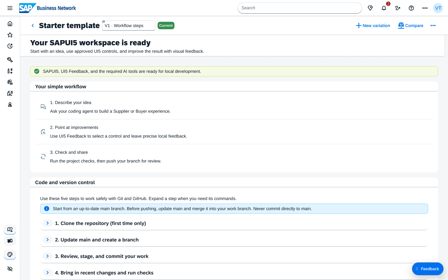
UI5 Starter is one shared studio for that work: describe a screen, get real SAPUI5 controls back, and share it through GitHub. I designed and built it in a month.
Role
Product designer and builder, design and code
Timeline
1 month · 3 releases
Team
Solo, with feedback from the SBN design team
Tools
SAPUI5, SAP Web UI Kit, UI5 and Figma MCP, Claude Code, GitHub
Context
SAP Business Network · internal design tooling
03 · AT A GLANCE
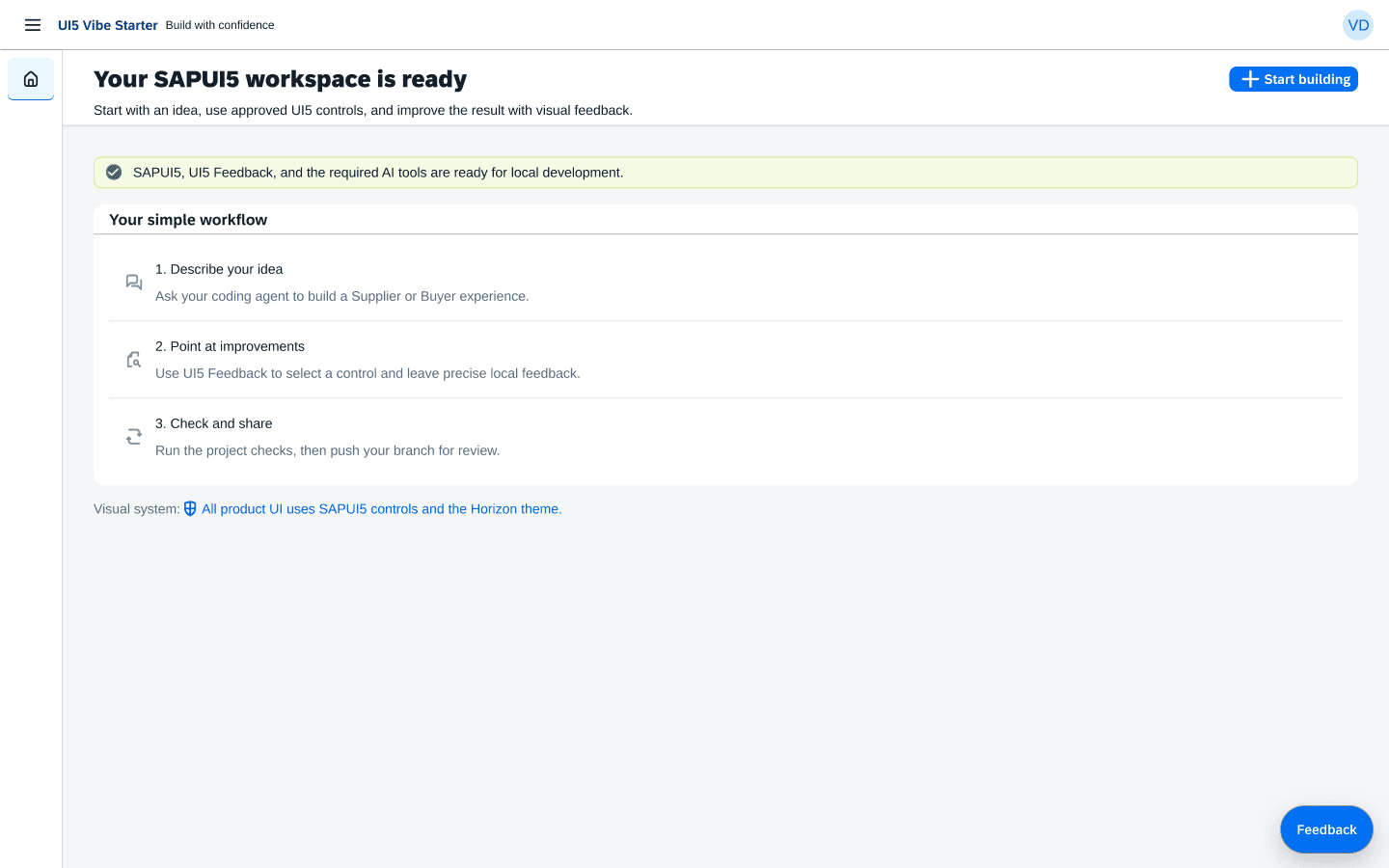
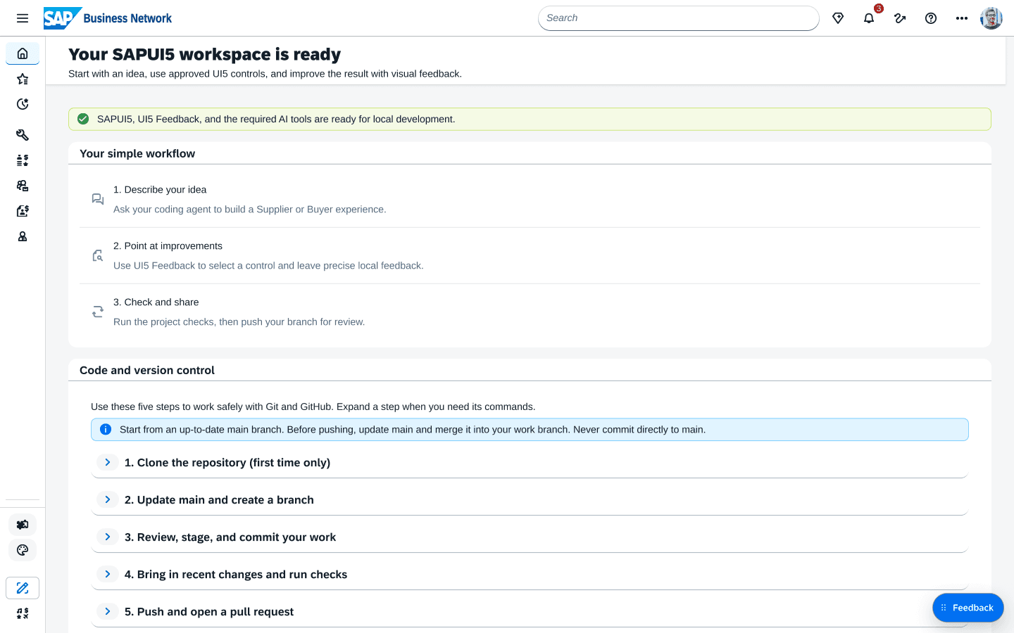
Three releases in a month, each one simpler.
8 → 4
steps in the core workflow
19 → 0
git commands on the first screen
6 → 2
fields to start a variation
Each number is counted from the code at that release, not from a survey. Steps are the workflow a new designer has to learn: set up, branch and review, update, and share.
04 · SAME PROMPT, DIFFERENT SCREENS
Everyone was vibe-coding, just not the same way.
Vibe-coding means building a screen by describing it to an AI assistant instead of drawing it.
A few designers were already using AI to mock up SAP screens, each with their own setup. That caused three problems:
- Every session started from scratch, with different prompts and reference files.
- The assistant guessed at controls it didn't know, so screens looked close to SAP but never matched.
- Work lived on one laptop, with no easy way to share it or stay current.
05 · TWO COMMANDS, THE WHOLE SYSTEM
I put the design system into the starter itself.
Before, every designer wired up prompts, tools, and references by hand. Now it takes two commands:
npm run setupinstalls the library, MCP servers, skills, and rules.npm run startopens the studio inside an SAP shell.
From there, the work moves through GitHub: branch and review, update, and share.
06 · A REAL SAP SHELL TO DESIGN IN
Designers work inside the product, not on a blank canvas.
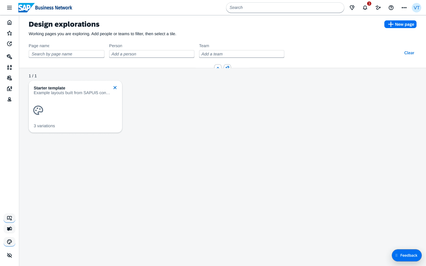
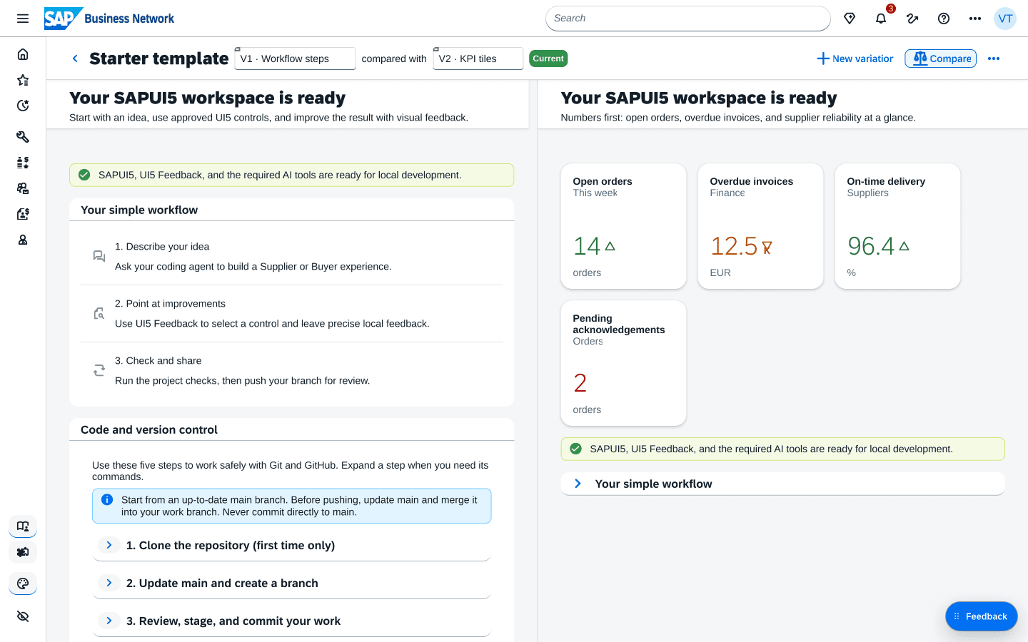
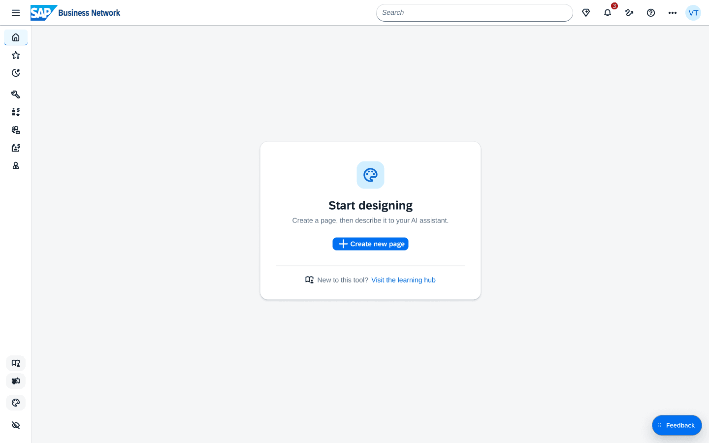
Every new screen opens inside a sample SAP Business Network shell, so designers work in context. Design explorations turns each page into a tile where you can save variations and compare two side by side. Every variation is a real UI5 view, so the one the team picks is already working code, not a mockup someone has to rebuild.
Most of the craft was taking things out. I showed each release at design share-outs and cut whatever tripped the team up. The Feedback panel, where designers click part of a page and tell their assistant what to change, lost a priority picker nobody could choose from, then everything else until it was two steps and one Save.
Saving took five tries, from Save and Save as buttons to a six-field dialog. What finally stuck was a New variation button in the title bar that only asks for a name.
08 · LOOKING BACK
Designers didn't need more tools, just the right ones loaded by default.
Version 2 tried to show everything at once, and in share-outs the multi-step setup was what confused people most. The system works best when it simply loads with the template and nobody has to think about it.
If I started again, I would:
- Begin from the template instead of a blank chat.
- Design in the running app instead of static mockups.
- Run share-outs earlier and more often, and let that feedback drive the agent directly.
8–10
designers and PMs across the company are using the studio now
- Do their screens stay consistent?
- Where do people still get stuck?
- What do PMs build on their own?