- 📉 Reduce average planning time from 45 min to under 15 min
- 📈 Achieve 40%+ week-one retention
- ❤️ Increase "trip completion intent" among Gen Z travelers by 25%
Problem: Travel planning feels like work.
60% of Gen Z abandon their trips before booking. Not for lack of money or time, but because today's tools are boring.
Solution: I made travel destination discovery delightful again.
Swipe through destinations and save what sparks joy. Travel planning, reimagined for how you already think.
Less really is more. Always.
Existing solutions don’t integrate inspiration with actionable planning. My project started with understanding that trip planning is complicated. And ultimately, it's hard for travelers to find ideas from outdated planning apps.
The result of fragmented travel planning tools? Trips never get booked.
Not because of money or time. Because the tools killed the momentum.
How did travel become my focus?
When I started planning my trip to Japan, I found myself trusting short-form videos over traditional travel guides because creators shared genuine stories about why they loved specific places. Their passion felt real. This made me curious about how others in Gen Z plan trips, so I decided to research these patterns.
Why aren't existing solutions enough?
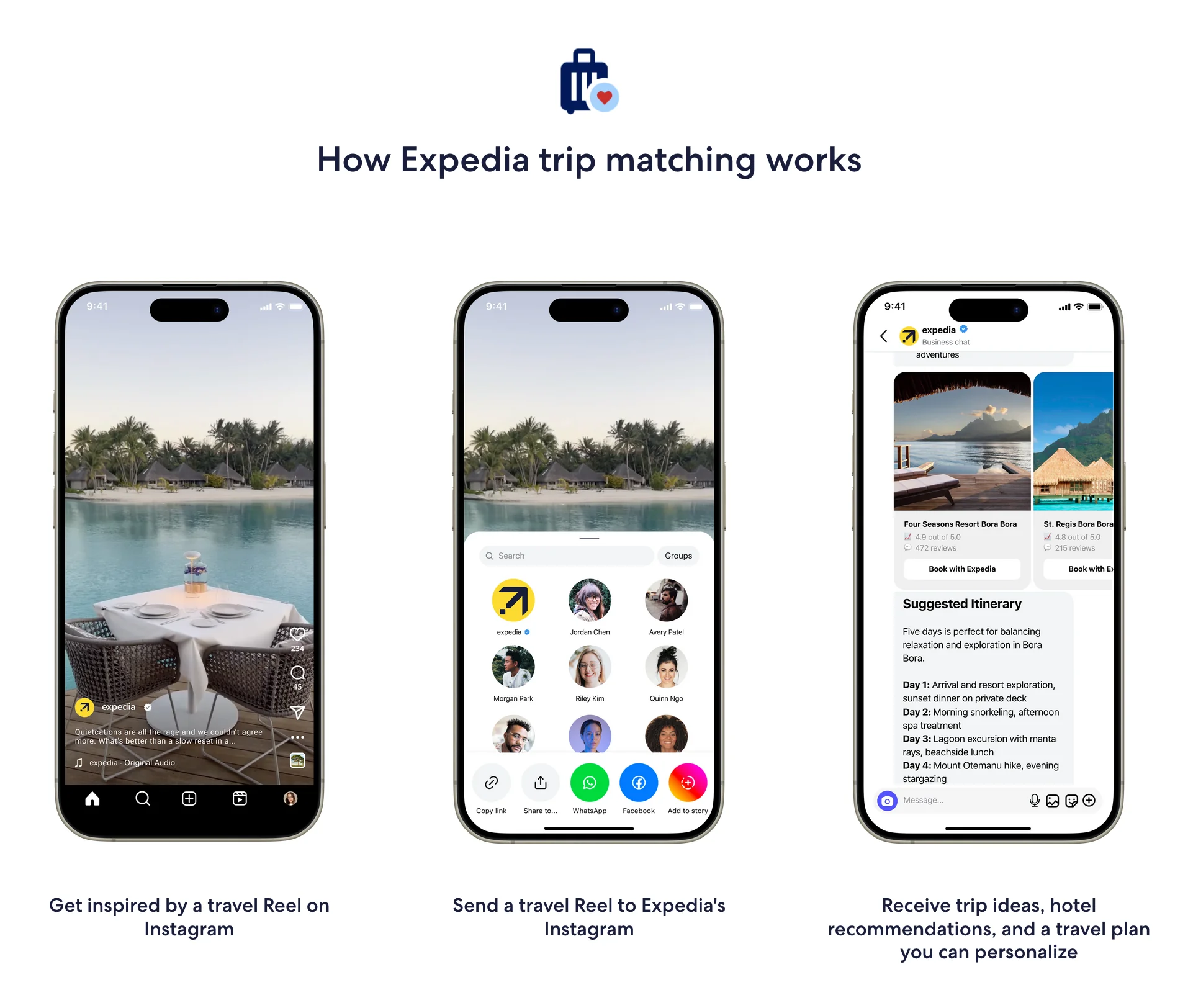
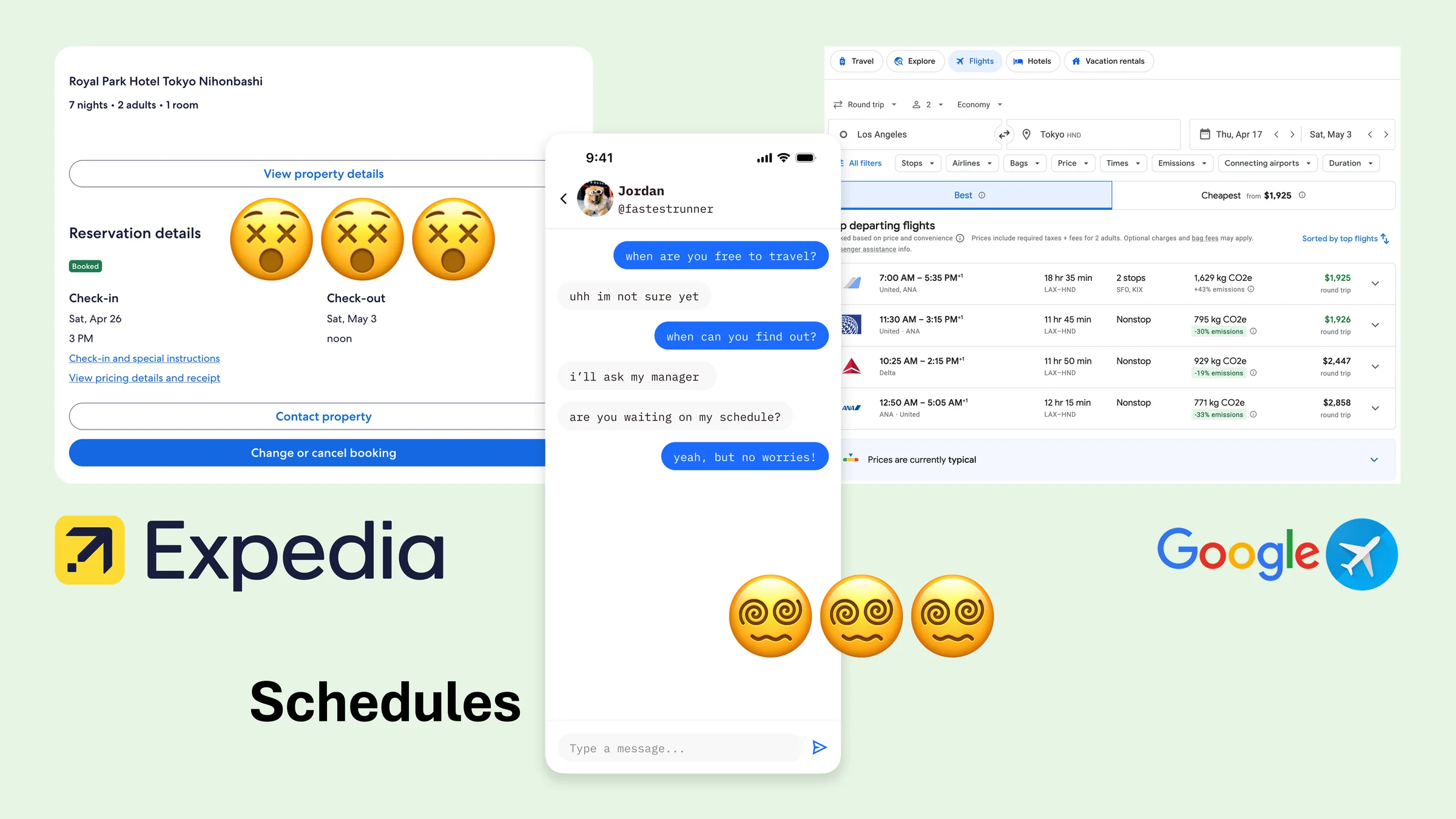
Looking at the big U.S. travel platforms in 2023-2024, only Expedia has cracked the social media problem. Their Trip Match feature lets you share an Instagram Reel and get back a bookable itinerary. However, travelers still have to leave Instagram to use it, and this is probably the first time you're even hearing about this feature.
Enter Trailmix
What if I let people plan inside an app that sources their inspiration while organizing their plans around locations?
No spreadsheets. No hour long planning marathons. Just swipe, save, and go.
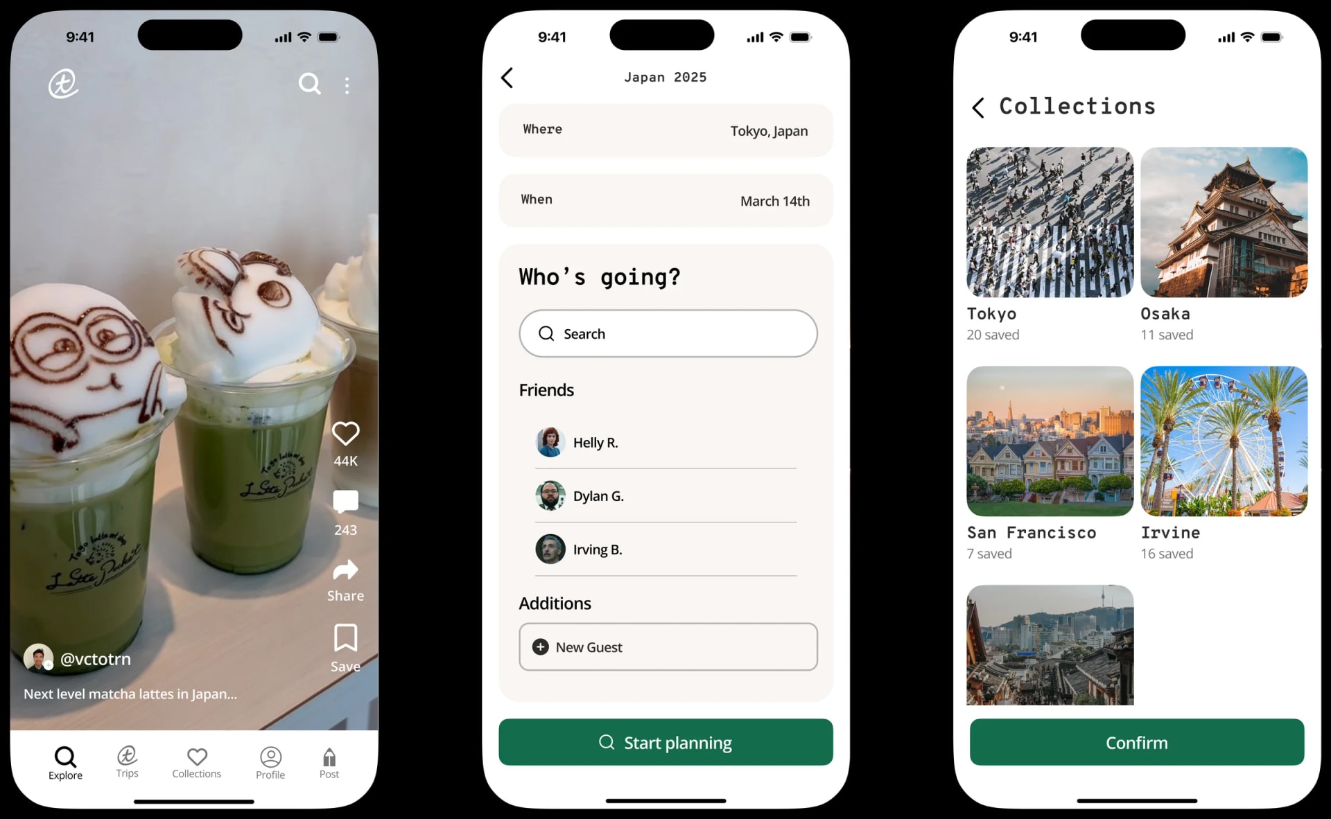
Create Your Trip in Seconds
No complex forms. Just three simple questions and you're ready to explore.
Discover Like You Already Do
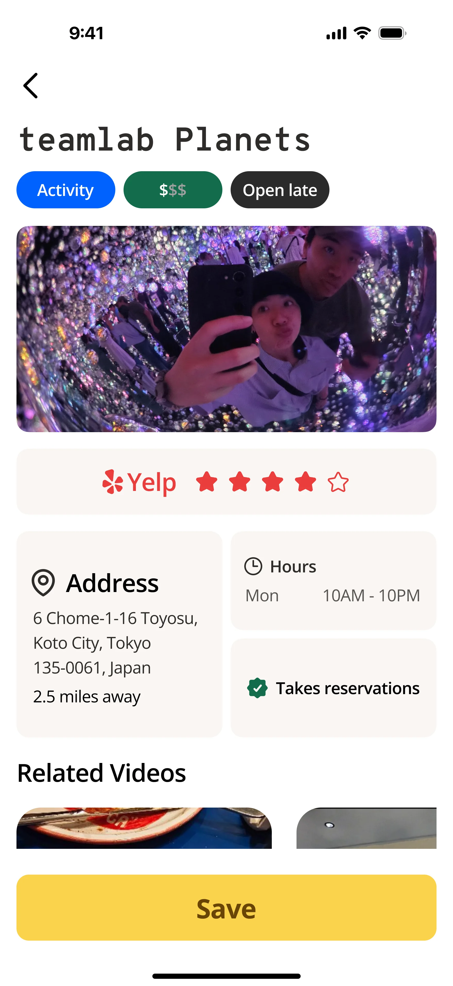
Swipe through destinations the same way you discover everything else. Visual, intuitive, and instantly saveable. No search queries required.
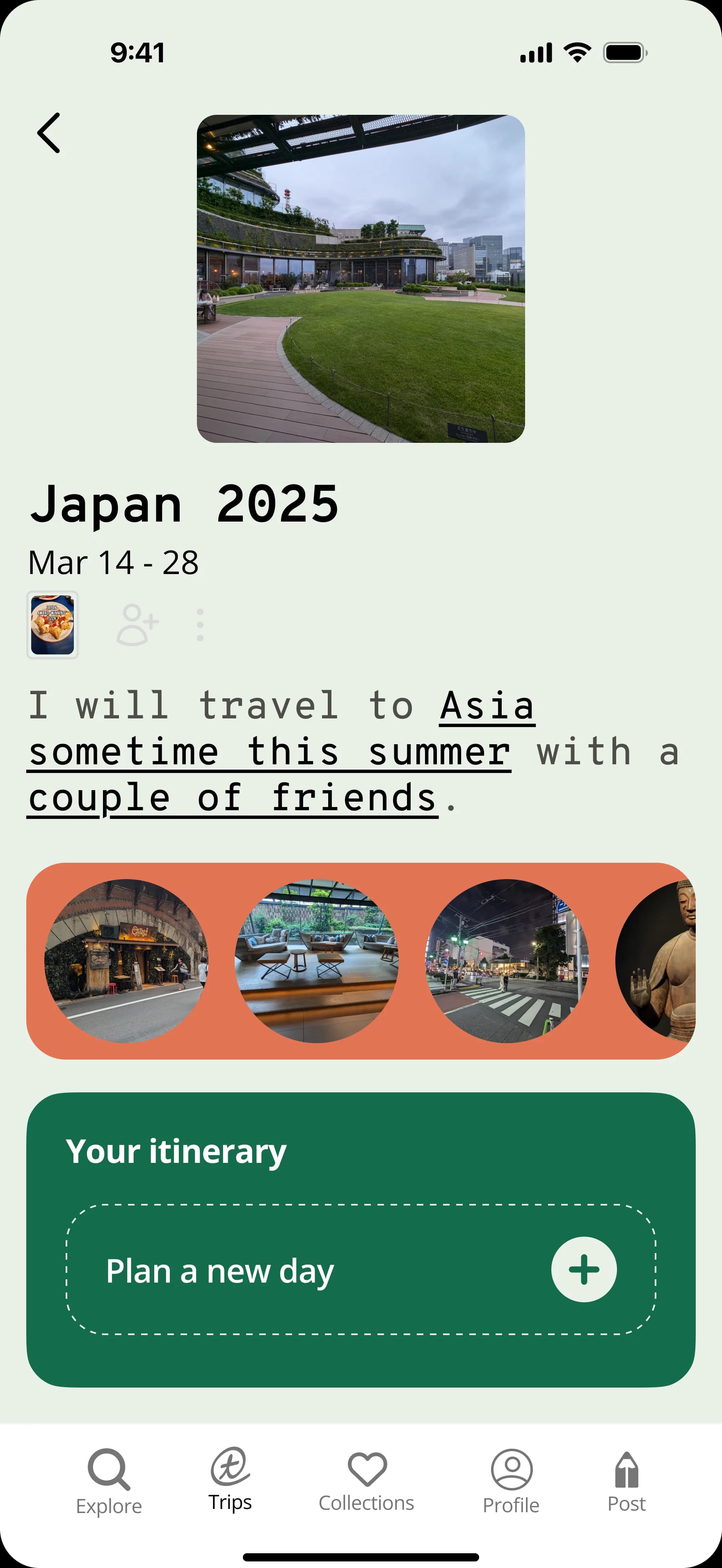
Plan Without the Spreadsheets
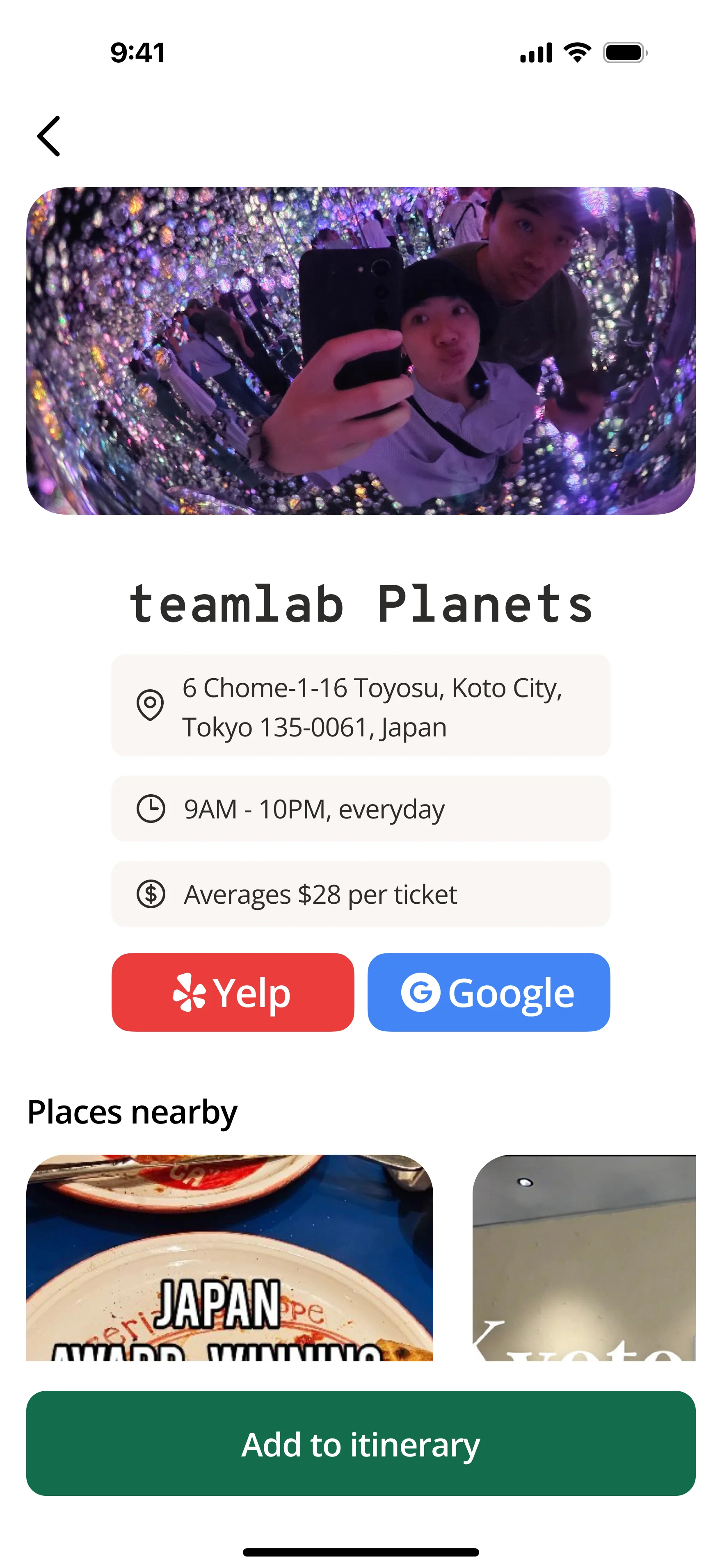
Organize activities by location and time naturally. Everything you save is automatically grouped and ready when you need it.
First, doodles

I sketched my ideas out to explore potential solutions and user flows first. My goal was to solidify concepts with the sketches.
Practice makes better

What building for Gen Z taught me
Three principles that changed how I think about product design
- ⚡ Reduced average planning time by 82% (45 min → 8 min)
- 🔄 Achieved 53% week-one retention (2× industry average)
- 💬 Users reported "planning feels fun again" and "way less stressful"
- Insight Action 1: Users discover trips on TikTok → One-tap TikTok import
- Insight Action 2: Groups plan asynchronously → Async group planning mode
- Insight Action 3: Booking drop-off happens late → Integrated booking flow
More adventures in design